The familiar version of attendance tracking looks organized right up until the event ends. You have registrations in one place, walk-ins in another, a staff member's manual count in a note app, and session scans sitting in a spreadsheet nobody fully trusts. By the time someone asks, “How many people came, which sessions mattered, and was the event worth it?”, the team is piecing together answers from fragments.
That's why attendance statistics matter. Not because event teams need more reports, but because they need a cleaner way to turn check-ins into decisions. If you run events in Google Workspace already, the jump from messy sheets to usable insight is smaller than many assume. The fundamental shift is not adopting a giant new analytics stack. It's deciding that every registration, scan, no-show, late arrival, and session visit should flow into one structure you can analyze.
Table of Contents
- Beyond Headcounts What Are Attendance Statistics
- Key Attendance KPIs You Should Be Tracking
- Choosing Your Data Collection Method
- Visualizing and Reporting Your Attendance Data
- How to Benchmark and Segment Your Audience
- Operational Uses for Your Event Team
- Actionable Steps for Your Next Event Cycle
Beyond Headcounts What Are Attendance Statistics
Attendance statistics are the working layer between check-in activity and business intelligence. They tell you who registered, who arrived, when they arrived, where they went, how long they stayed, and which groups engaged differently. A headcount answers one question. Good attendance statistics answer operational, financial, and audience questions at the same time.
That distinction matters because presence drives outcomes. In education, absenteeism accounted for up to 45% of the recent decline in 4th-grade reading scores according to The Nation's Report Card analysis summarized by NAGB. Event teams should read that as a practical reminder, not a school-only fact. If people don't show up, don't reach sponsored sessions, or drop off after the opening block, the program can't deliver the result you planned.
Teams often already collect attendance data. The problem is that they collect it casually. Registrations sit in one spreadsheet, ticket scans in another, and room-level counts live in someone's memory or post-event notes. That setup makes it hard to answer simple questions with confidence.
What attendance statistics actually include
At event level, attendance statistics usually cover a mix of these records:
- Registration status: Who intended to attend
- Check-in status: Who arrived at the venue
- Time stamps: When each attendee entered
- Session participation: Which talks, workshops, or zones they visited
- Return behavior: Whether they came back on later days or later sessions
- Exceptions: Walk-ins, duplicates, transfers, and denied entries
When these records live in a structured sheet, they stop being admin residue and start becoming evidence.
Practical rule: If your team can't explain exactly how “attended” is defined, your attendance statistics won't hold up in a sponsor report or internal review.
Why this becomes ROI data
Attendance statistics help event teams prove value in three ways. First, they show whether demand turned into actual turnout. Second, they reveal where engagement was concentrated, which matters more than a single total. Third, they expose friction points such as long check-in lines, weak session pull, or audience segments with high no-show behavior.
That's why I treat attendance as an operations dataset, not a front-desk task. The check-in table is often the cleanest source of truth you have after an event. If you structure it well from the start, it becomes the foundation for staffing decisions, sponsor reporting, follow-up campaigns, and next-event planning.
Key Attendance KPIs You Should Be Tracking
Teams often start with one metric: total attendees. That's useful, but it's not enough to manage performance. A solid attendance framework separates turnout, engagement, punctuality, and retention so you can see where the event worked and where it leaked value.
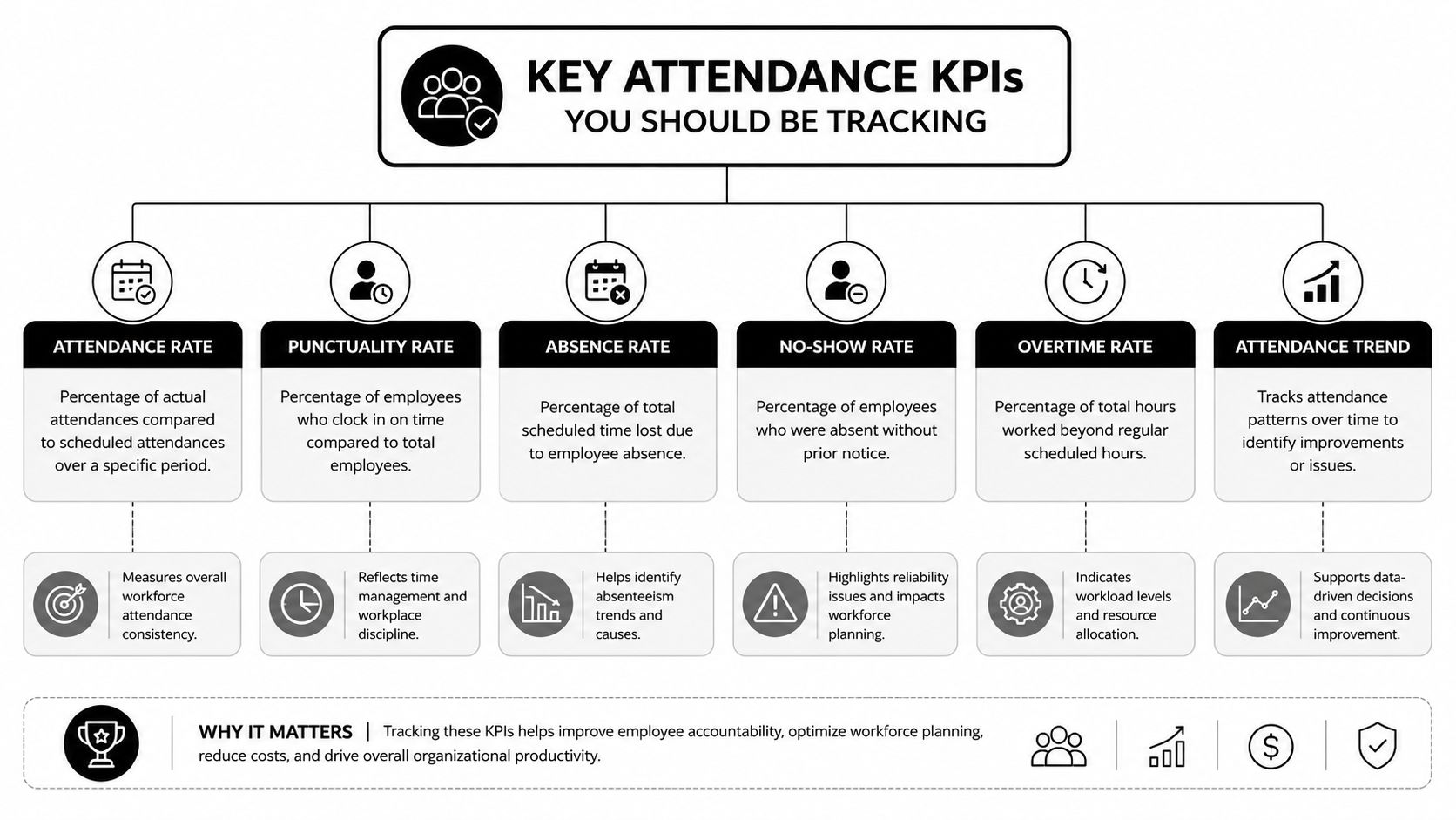
The difference between presence and engagement
One of the biggest reporting mistakes is treating venue attendance as equal to meaningful participation. Education data makes this point clearly. A system can show 90% attendance overall while still having 26% of individuals with serious attendance problems, as discussed in Ohio attendance documentation and the related ADA versus chronic absenteeism distinction. For events, the parallel is obvious. A venue can look full while a large share of attendees skips the sessions or zones that mattered most.
That's why session-level and stage-level KPIs belong next to your overall attendance rate.
Essential Attendance KPIs and Formulas
| KPI | What It Measures | Simple Formula |
|---|---|---|
| Attendance rate | How much of your registered audience actually showed up | Checked-in attendees / Total registered attendees |
| No-show rate | How much registered demand failed to convert into presence | Registered attendees who did not check in / Total registered attendees |
| Walk-in share | How much of turnout came from non-registered arrivals | Walk-in attendees / Total checked-in attendees |
| On-time check-in rate | How many attendees arrived before your defined cutoff | On-time check-ins / Total checked-in attendees |
| Session attendance rate | How many event attendees entered a specific session | Session check-ins / Total checked-in attendees |
| Session fill rate | How well a session used its available capacity | Session attendees / Session capacity |
| Multi-day retention | How many attendees returned across event days | Day 2 or later check-ins / Day 1 check-ins |
| Zone participation | How much traffic each area or activation received | Zone scans / Total checked-in attendees |
| Re-entry frequency | How often attendees left and came back | Total re-entry scans / Unique attendees with access |
| Staff processing speed | How quickly the entry team handled arrivals | Total processed check-ins / Check-in period |
You don't need every KPI for every event. A breakfast briefing may only need registration-to-check-in conversion, arrival time, and no-show analysis. A conference needs day-level retention, session attendance, sponsor-zone traffic, and likely subgroup comparisons.
A useful rule is to keep one KPI from each category:
- Turnout metric: Attendance rate or no-show rate
- Flow metric: On-time check-in rate
- Engagement metric: Session attendance or zone participation
- Retention metric: Return attendance for later sessions or later days
Track fewer KPIs, but define them tightly. Teams get into trouble when they measure ten things loosely instead of four things consistently.
If you're building dashboards in spreadsheets and want a stronger foundation for metric design, this essential guide for Excel users on KPIs is a useful companion because it helps teams avoid vague scorecards and choose indicators that can support decisions.
Choosing Your Data Collection Method
The quality of your attendance statistics depends on how the data enters the system. If collection is inconsistent, reporting will stay messy no matter how polished the dashboard looks later. Most event teams choose between manual entry, semi-automated collection, and QR-based scanning. Each has a place. Each also has failure points.
Manual methods still have a place
Manual check-in usually means printed guest lists, spreadsheet updates, or a staff member marking names in real time. This can work for small workshops, board meetings, or low-volume internal events where staff know most attendees by name.
Its strengths are simplicity and low setup effort. Its weaknesses show up fast when the door gets busy.
- Duplicate names create confusion: Staff hesitate, then lines grow
- Handwritten corrections introduce errors: Someone gets marked absent after arriving
- Session tracking becomes unrealistic: Teams rarely maintain clean logs across multiple rooms
- Reporting takes too long: Post-event cleanup becomes a second project
Semi-automated methods improve this by using digital forms, tablets, or one central sheet that staff update directly. If you're using Google Workspace, a practical middle step is QR code attendance for Google Forms, where staff or attendees submit structured records into one dataset instead of spreading them across separate lists.
Clean reporting starts at the door. If staff have to “fix it later,” they usually won't have enough clean data to fix.
Where QR workflows change the game
For multi-session, multi-day, or higher-volume events, QR workflows are usually the most reliable option because they reduce interpretation. The ticket contains the attendee identity. The scan records the action. The sheet updates from the scan event, not from a later manual rewrite.
A typical setup looks like this:
- Build the attendee list in Google Sheets
- Generate unique tickets with QR codes
- Distribute tickets by email or messaging
- Scan at entry, session doors, or controlled zones
- Sync scan results back into the same attendance sheet
That's why teams often move to tools built around QR code tickets for Google Sheets or QR code ticket check-in for Sheets. The advantage isn't just faster entry. It's that the same workflow creates structured data you can report on immediately.
For teams comparing workflows, this guide to an attendance tracking system for events is useful because it frames the decision around operational fit rather than software hype.
One practical option in this category is Darkaa. It turns Google Sheets and Google Forms into a QR ticketing and check-in workflow, records scan results back into Sheets, and supports offline validation with later sync. For event teams that already live in spreadsheets, that matters because it reduces retraining and keeps the attendance dataset in a tool they already use.
The trade-off is straightforward. Manual methods are flexible but fragile. QR systems take setup discipline upfront, but they produce cleaner attendance statistics with far less reconciliation later.
Visualizing and Reporting Your Attendance Data
Raw check-in data is rarely persuasive on its own. A stakeholder doesn't want to read scan logs. They want to see whether turnout matched demand, whether key sessions held attention, and whether the audience profile looked the way the team expected.
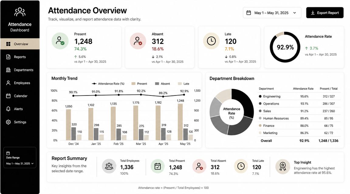
Build dashboards for decisions, not decoration
A good attendance dashboard answers a small set of operational questions quickly. Start with one summary area at the top, then add supporting visuals below it.
Use chart types intentionally:
- Line charts work for arrival patterns across time blocks, event days, or recurring event series
- Bar charts work for comparing sessions, entry points, ticket types, or campaign sources
- Pie charts can work for simple audience composition views, but only when the number of categories stays small
- Tables with conditional formatting work well for exception handling, such as unchecked VIPs, late-heavy sessions, or low-performing registration sources
The best dashboards also keep definitions visible. If “attendance” means first venue scan, say that. If “session attendance” includes only scanned entries, say that too. Ambiguous labels create avoidable arguments later.
A lot of teams also underestimate the cleanup needed before reporting. Sponsor lists may arrive as PDFs, handwritten rooming changes may get scanned, and venue staff may send static reports in awkward formats. In those cases, PDF AI's data extraction guide is useful for turning locked attendance-related documents into workable tables before they hit your master sheet.
Reports different stakeholders actually read
A sponsor, venue manager, and internal leadership team should not receive the same report. They care about different parts of the attendance story.
Here's a practical split:
- Internal operations report: Arrival waves, queue pressure points, scan exceptions, and session utilization
- Sponsor report: Attendance for sponsored sessions, booth or zone traffic, and attendee segment mix
- Leadership summary: Registration-to-attendance conversion, top-performing segments, and recommendations for next event design
The dashboard should also live somewhere your team can access without version confusion. If your attendance data already sits in Sheets, keeping reporting in a shared cloud workflow usually saves time and reduces export errors. This overview of cloud event management for collaborative reporting is helpful if your current process still depends on local files and post-event email chains.
Later in the reporting process, a short walkthrough video often helps non-technical stakeholders read the data correctly:
A dashboard should shorten conversations, not create new ones. If people need a meeting just to understand the chart labels, the report is doing too much and saying too little.
How to Benchmark and Segment Your Audience
Benchmarking matters because a raw attendance number has no context. Segmenting matters because an average can hide the exact group you need to understand. Teams that only look at event-wide totals usually miss both the problem and the opportunity.
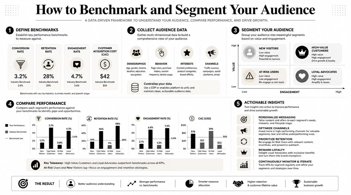
Why event-wide averages mislead
An event average is like a citywide weather report. It tells you something real, but not enough to decide whether to carry an umbrella in your exact neighborhood. Event attendance works the same way. You might report a healthy overall turnout and still have one ticket type, one campaign source, or one sponsor audience that underperformed badly.
That's why subgroup analysis is essential. Education data shows recovery hasn't been even across groups, and FutureEd's chronic absenteeism analysis by subgroup makes the broader point clearly: a strong headline rate can hide weaker performance in specific populations. Event teams face the same risk when they report one top-line attendance number and stop there.
Useful segments for real event teams
The most useful segments are the ones tied to decisions you can make next time. Start with fields you already collect and trust.
Common high-value cuts include:
- Ticket type: VIP, general admission, partner pass, staff, speaker
- Registration source: Paid campaign, partner referral, direct invite, organic signup
- Company or organization: Especially useful in B2B conferences and private events
- Session interest or track: Helpful when agendas span multiple themes
- Geography: Useful for regional events and travel-sensitive attendance patterns
Then benchmark each segment against a prior event, a prior edition of the same event, or your internal target. Don't benchmark everything. Pick the few comparisons that would change planning.
For example, if invited guests from partner channels register well but check in poorly, the fix may be reminder timing, not acquisition. If workshop attendees stay engaged but keynote-only pass holders leave early, the issue may be schedule design or pass packaging. That's what segmentation gives you. It turns attendance statistics from a score into a diagnosis.
Operational Uses for Your Event Team
Attendance data earns its keep when the team uses it while the event is still running and after the doors close. Otherwise, it becomes a nice report that arrives too late to change anything.
What live attendance data changes during the event
A live scan feed can solve practical problems fast. If one entrance is overloaded while another is quiet, operations can reassign staff. If a breakout room fills faster than expected, the team can redirect arrivals before the doorway jams. If a sponsor lounge stays quiet, someone can trigger a host-led push instead of discovering the problem after teardown.
These decisions don't require fancy analytics. They require trustworthy inputs and a team that knows which thresholds matter.
A few examples:
- Staffing adjustments: Move check-in staff based on arrival surges rather than fixed schedules
- Room control: Open overflow seating or hold access when a session reaches safe capacity
- Catering corrections: Shift replenishment toward areas with actual footfall instead of original estimates
- Speaker support: Alert moderators when a session is drawing below-plan attendance and may need a format adjustment
For teams trying to connect entry data with venue execution, this guide to event logistics software and operational coordination is a useful reference because it links attendance visibility to staffing, flow, and service delivery.
What post-event attendance data unlocks
After the event, attendance statistics become your targeting layer. Instead of sending one generic follow-up to everyone, you can send different messages based on actual behavior.
That might mean:
- Attended a workshop: Send slides, recordings, or related sessions
- Checked in but skipped a sponsor activation: Send a personalized sponsor recap
- Registered but never arrived: Send a short “we missed you” message with the next event invite
- Returned across multiple sessions: Flag for loyalty or VIP outreach
One data point from education outreach is worth keeping in mind here. A report found that 48.4% of chronically absent students returned after a single intervention, according to the SchoolStatus attendance trends report. Event teams shouldn't treat that as a direct event benchmark, but the operational lesson is strong: targeted follow-up often works better than broad reminders.
If someone registered and missed the event, don't dump them into the same nurture flow as a random lead. They already raised their hand once.
Attendance statistics evolve from simple reporting to inform revenue support, sponsor value, and audience retention.
Actionable Steps for Your Next Event Cycle
Teams often don't need more attendance data. They need a repeatable attendance process. The fastest improvement usually comes from choosing a few reliable definitions, collecting data in one place, and reviewing it the same way after every event.
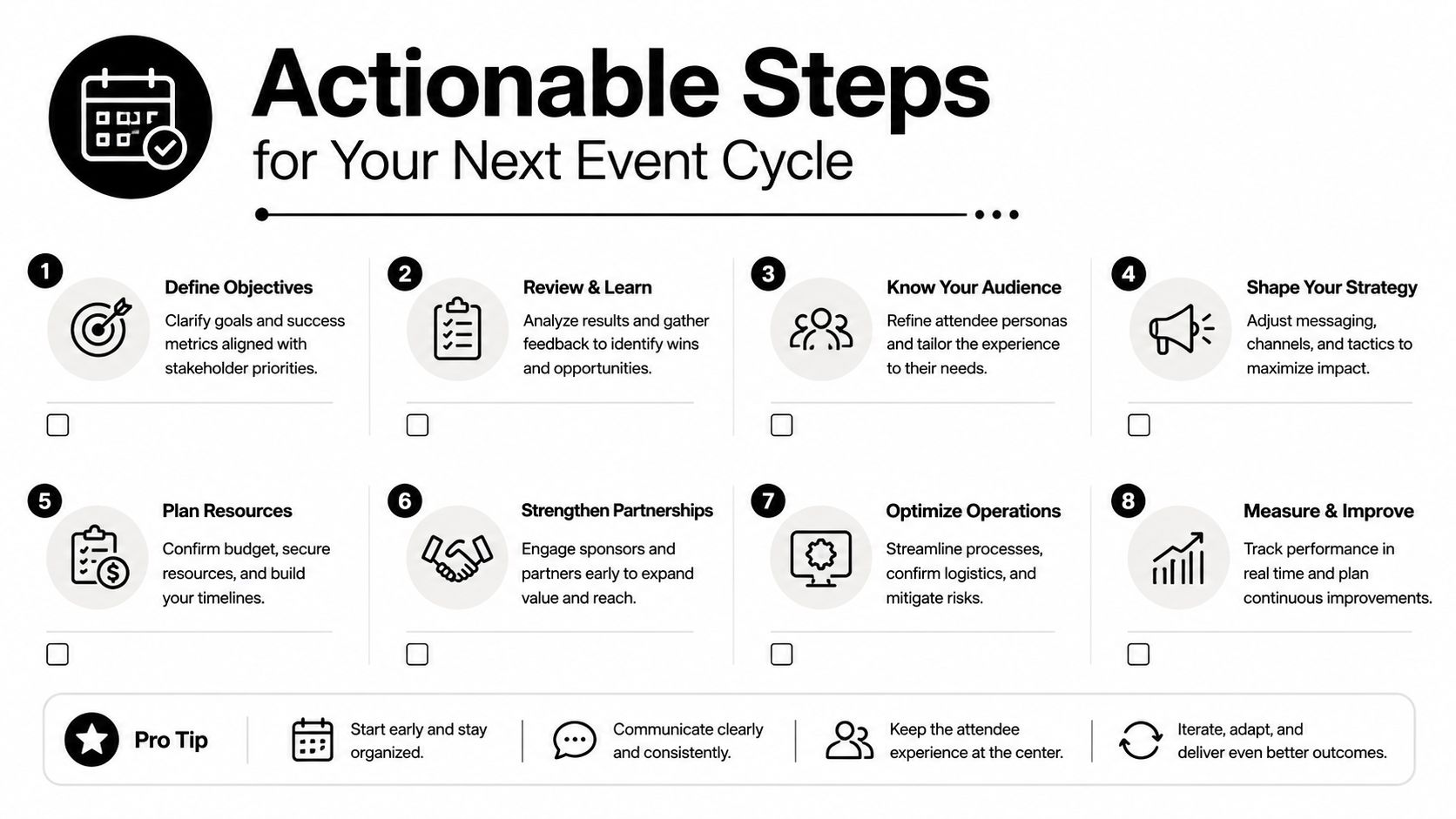
A practical event cycle to follow
Use this cycle for your next event:
- Set attendance goals early. Decide what counts as success before registration opens. That may mean venue turnout, session participation, repeat attendance, or sponsor traffic.
- Define your fields before launch. Keep one source of truth for attendee ID, ticket type, session access, check-in time, and attendance status.
- Choose a collection method that matches complexity. Small events can stay simple. Multi-day or multi-zone events need structured scanning.
- Test edge cases. Run through duplicates, walk-ins, offline entry, denied access, and re-entry before event day.
- Monitor during the event. Review live numbers often enough to make staffing, room, or communication decisions while they still matter.
- Report by segment, not only by total. That's where planning insight usually appears.
- Run one post-event review within a few days. Capture what failed while the details are still fresh.
- Carry the same KPI definitions into the next event. Trend lines only help when the calculation stays consistent.
One last mindset shift matters here. In education, chronic absenteeism affected over a quarter of students nationally in the latest federal data, and the U.S. Department of Education's reporting shows how small daily attendance issues can become large systemic problems over time in its chronic absenteeism overview. Events face the same pattern in a smaller window. A 10-15% no-show rate isn't background noise. It's lost engagement, weaker room energy, softer sponsor results, and missed follow-up opportunities.
Treat attendance statistics as part of event design, not post-event paperwork. When the data starts clean, the decisions get easier.
If you want to keep attendance tracking inside tools your team already knows, Darkaa is built around that workflow. It turns Google Sheets and Google Forms into a QR code ticketing and check-in system, so you can generate tickets, scan arrivals, sync attendance back into Sheets, and report from the same dataset instead of rebuilding everything after the event.